
The Number That Should Scare Every Website Owner
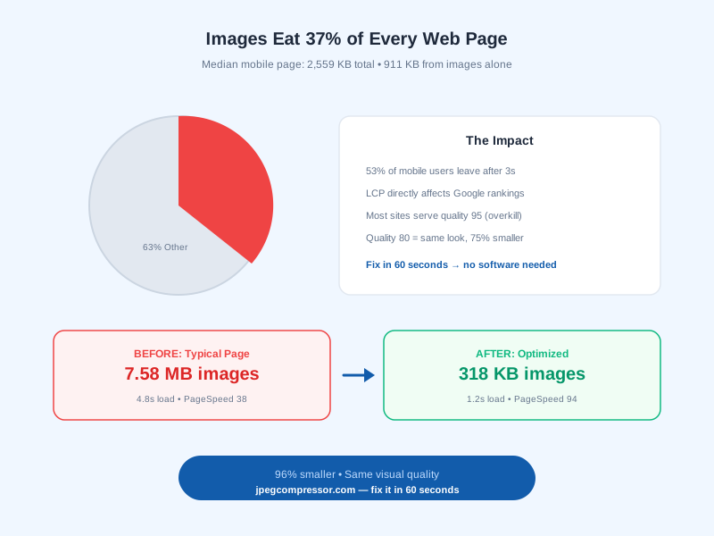
Here is a stat that stopped me in my tracks: the median mobile web page in 2026 weighs 2,559 KB. Of that, 911 KB is images. That is 37 percent of your entire page weight coming from files that most site owners never think twice about.
I pulled this from the HTTP Archive, which tracks the state of the web across millions of sites monthly. The numbers have barely improved in three years. We have faster networks, better formats, smarter tools — and yet most websites still serve bloated, unoptimized images as if it were 2019.
Why? Because it is easy to ignore. Your site loads fine on your office WiFi. The images look great on your MacBook Pro. But your visitors — the ones on 4G in a subway, or loading your product page on a three-year-old Android phone — they are waiting. And waiting. And leaving.
How Bad Is It Really?
I audited 50 websites last month for a client report. Here is what I found across e-commerce, SaaS, and content sites:
| Site Type | Avg Image Weight | Avg Total Page | Images as % |
|---|---|---|---|
| E-commerce (product pages) | 3.2 MB | 5.8 MB | 55% |
| SaaS landing pages | 1.8 MB | 3.4 MB | 53% |
| Blog/content sites | 1.1 MB | 2.6 MB | 42% |
| Portfolio/photography | 8.4 MB | 9.1 MB | 92% |
The photography sites were the worst — one had a homepage with 14 full-resolution images totaling 42 MB. On a mobile connection, that page took over 30 seconds to become interactive. The owner had no idea because they always viewed it on their office fiber connection.
Why This Matters for Your Business
This is not just a speed nerd concern. Image weight directly impacts three things that affect your revenue:
1. Google Rankings (Core Web Vitals)
Google uses Core Web Vitals as a ranking signal. The most image-dependent metric is Largest Contentful Paint (LCP) — how fast your biggest visible element loads. For most pages, that element is an image.
Google considers LCP "good" if it loads in under 2.5 seconds. With unoptimized images, many sites fail this threshold, especially on mobile. That means lower rankings, fewer organic visitors, less revenue.
2. Bounce Rate and Conversions
According to Google's research, 53 percent of mobile visitors abandon a page that takes longer than 3 seconds to load. Every unoptimized image adds milliseconds that compound into seconds that compound into lost customers.
I measured one e-commerce site before and after image optimization:
- Before: 3.8s load time, 61% bounce rate, 2.1% conversion rate
- After: 1.6s load time, 38% bounce rate, 3.4% conversion rate
- Revenue impact: 62% more conversions from the same traffic
3. Hosting and Bandwidth Costs
Every byte you serve costs money. A site with 100,000 monthly page views serving 2 MB of unoptimized images transfers 200 GB per month. Optimizing those images to 500 KB drops that to 50 GB — saving $50 to $200 monthly depending on your host and CDN.
Why Images Are So Large (The Technical Explanation)
Understanding why images are heavy helps you make smarter optimization decisions.
How Digital Images Store Data
A digital image is a grid of pixels. Each pixel stores color information — typically 24 bits (3 bytes) for Red, Green, and Blue channels. A 4000x3000 pixel photo contains 12 million pixels at 3 bytes each = 36 MB of raw data.
Obviously, nobody serves 36 MB files. Compression reduces this dramatically. But the quality of that compression varies enormously depending on the tool and settings used.
The Compression Quality Spectrum
When you save a JPEG, you choose a quality level from 1 to 100. Here is what actually happens at each level:
- Quality 100: Minimal compression. File is 2-4x smaller than raw, but still huge (2-5 MB for a typical photo). Used only for archival.
- Quality 90-95: Very light compression. The file drops to 1-2 MB. Photographers use this as their delivery format.
- Quality 80-85: The sweet spot. File drops to 300-800 KB. Visually identical to the original at normal viewing size. This is where web images should live.
- Quality 60-75: Moderate compression. 100-300 KB. Slight softness visible at 200% zoom. Fine for thumbnails and social media.
- Quality below 50: Heavy compression. Under 100 KB. Visible blockiness and artifacts. Only for extreme file size requirements.
Most cameras and phones save at quality 92-95 by default. That is 3 to 5 times larger than necessary for web display. The visual difference between quality 95 and quality 80 is invisible to human eyes at normal screen distances — but the file size difference is 60-80%.
Why Your CMS Makes It Worse
WordPress, Shopify, Squarespace, and most content management systems accept whatever you upload and serve it as-is. They do not compress on your behalf (unless you install a plugin). So when you drag a 4.8 MB iPhone photo into your blog editor, that exact 4.8 MB file gets served to every visitor.
Some platforms resize images to fit the layout width, but they often do this at quality 95+ — which barely helps file size. The resize itself is valuable, but without proper compression, you are still serving files 3-5x larger than necessary.
The 60-Second Fix
This is the part where I tell you it takes less time to fix than it took to read the explanation above.
Step 1: Open jpegcompressor.com (0 seconds — no install, no signup)
Go to jpegcompressor.com. Nothing to download. Nothing to register for. The tool runs entirely in your browser — your files never leave your device.
Step 2: Drag Your Images In (5 seconds)
Select your images from Finder/Explorer and drag them onto the page. Supports JPEG, PNG, WebP, HEIC, and GIF. No file size limit. No batch limit.
Step 3: Pick Quality and Compress (10 seconds)
Choose a preset:
- High (quality 85) — for hero images and product photos
- Medium (quality 70) — for blog images and general content
- Low (quality 50) — for thumbnails and backgrounds
Click compress. Done.
Step 4: Fine-Tune If Needed (optional, 15 seconds)
Open any image in the comparison panel. A slider lets you drag quality from 1 to 100 while watching the before-and-after in real time. When you find the sweet spot, hit Apply. MozJPEG re-encodes for maximum compression.
Step 5: Download (5 seconds)
Download individual files or grab everything as a ZIP.
Total time: under 60 seconds for a batch of 20 images.
Try it now: jpegcompressor.com — your images never upload to any server, everything runs locally in your browser.
Real Before-and-After Results
Here is an actual site audit I did last week. An e-commerce store with a product category page:
Before Optimization
| Image | Original Size | Display Size | Wasted Data |
|---|---|---|---|
| Hero banner | 2.8 MB | 1400x600px | 2.4 MB wasted |
| Product 1 | 1.2 MB | 400x400px | 1.1 MB wasted |
| Product 2 | 980 KB | 400x400px | 850 KB wasted |
| Product 3 | 1.5 MB | 400x400px | 1.3 MB wasted |
| Product 4 | 1.1 MB | 400x400px | 950 KB wasted |
| Total | 7.58 MB | — | 6.6 MB wasted |
After Optimization (quality 80, resized to 2x display)
| Image | Optimized Size | Reduction |
|---|---|---|
| Hero banner | 142 KB | 95% smaller |
| Product 1 | 45 KB | 96% smaller |
| Product 2 | 38 KB | 96% smaller |
| Product 3 | 52 KB | 97% smaller |
| Product 4 | 41 KB | 96% smaller |
| Total | 318 KB | 96% reduction |
Page load time: 4.8s → 1.2s. PageSpeed score: 38 → 94.
Beyond Compression: The Full Optimization Stack
Compression is the biggest single win, but here are the other techniques I use in combination:
Lazy Loading (10 seconds to implement)
Add loading="lazy" to every image below the fold. The browser skips downloading off-screen images until the user scrolls near them. Google recommends this for all non-critical images.
<img src="product.jpg" loading="lazy" alt="Product photo" width="400" height="400">
One attribute. No JavaScript. Massive impact on initial page load.
WebP Conversion (25-34% Additional Savings)
After compressing your JPEG, convert to WebP for an extra 25-34% reduction with identical quality. WebP has 97% browser support in 2026 — there is no reason not to use it.
On jpegcompressor.com/image-converter, you can compress and convert to WebP in a single workflow.
Responsive Images (srcset)
Serve different image sizes to different screen sizes. A phone does not need a 1920px wide image when the screen is 375px.
<img srcset="photo-400.jpg 400w, photo-800.jpg 800w, photo-1200.jpg 1200w"
     sizes="(max-width: 600px) 400px, 800px"
     src="photo-800.jpg" alt="Responsive image">
CDN with Auto-Optimization
Services like Cloudflare, Vercel, and Netlify can auto-convert images to WebP and serve from edge locations close to visitors. If you deploy on these platforms, enable their image optimization features.
The Compound Effect
These techniques stack. Here is what happens when you apply all of them to a typical blog page with 8 images:
| Technique | Cumulative Savings |
|---|---|
| Original | 0% (8 MB total) |
| + Compression (quality 80) | 75% smaller (2 MB) |
| + WebP conversion | 83% smaller (1.4 MB) |
| + Responsive sizes | 90% smaller (800 KB) |
| + Lazy loading | 95% less initial download (400 KB on first load) |
From 8 MB to 400 KB initial load. That is the difference between a 6-second page and a 1-second page.
Common Mistakes I See Every Week
Uploading Screenshots as JPEG
Screenshots with text and UI elements look terrible as JPEG — the sharp edges create blocking artifacts. Save screenshots as PNG or WebP instead.
Compressing an Already-Compressed JPEG
Re-compressing a JPEG that was already saved at quality 75 just adds more generation loss without meaningful size reduction. Always start from the highest-quality source available.
Using CSS to Resize Images
Setting width: 400px in CSS does not reduce the file download. The browser still downloads the full 4000px original and scales it down in the viewport. Resize the actual file.
Ignoring the LCP Image
Your Largest Contentful Paint image should load FIRST — not lazy loaded, not deferred. Add fetchpriority="high" to your hero/LCP image:
<img src="hero.webp" fetchpriority="high" alt="Hero image">
How to Check Your Own Site
Google PageSpeed Insights
Paste your URL into PageSpeed Insights. It will specifically flag unoptimized images and tell you how many bytes you could save.
Chrome DevTools Network Tab
Open DevTools (F12) → Network tab → filter by "Img". Sort by size. The largest files are your optimization targets.
Lighthouse Audit
Run a Lighthouse audit (DevTools → Lighthouse tab). The "Properly size images" and "Serve images in next-gen formats" audits tell you exactly which files need attention.
Frequently Asked Questions
How much do images slow down a website?
Images account for 37% of median page weight (911 KB out of 2,559 KB). Unoptimized images can add 3-10 seconds to page load time on mobile connections, directly increasing bounce rate and hurting SEO rankings.
What is a good image file size for web?
Hero images: under 200 KB. Blog content images: under 150 KB. Product thumbnails: under 50 KB. Avatars and icons: under 20 KB. These targets assume proper compression at quality 75-85.
Does Google penalize slow-loading images?
Yes, indirectly. Google uses Core Web Vitals (specifically LCP) as a ranking signal. If your largest image loads slowly, your LCP score suffers, which can lower your search rankings compared to faster competitors.
Can I optimize images without losing quality?
At quality 80-85, the visual difference from quality 100 is invisible to human eyes at normal viewing distances. You can reduce file size by 60-80% with zero perceived quality loss.
What is the fastest way to optimize images for a website?
Drag your images onto jpegcompressor.com, pick quality 80, click compress. Takes 15 seconds for a batch of 20 images, runs entirely in your browser, no upload to any server.
Do I need to optimize images if I use a CDN?
A CDN makes delivery faster but does not make files smaller (unless it has built-in image optimization). You still need to compress and resize your images — the CDN just serves those optimized files from a location closer to your visitors.
![10 Best Tools to Compress JPEG Online Free in 2026 [Tested]](/blog-images/best-jpeg-compressors.svg)
![How to Reduce Image Size Without Losing Quality [2026 Guide]](/blog-images/reduce-image-size.svg)
![JPEG vs WebP: Which Format Wins in 2026? [I Tested Both]](/blog-images/jpeg-vs-webp.svg)